Town of Berthoud, Colorado Rebrand
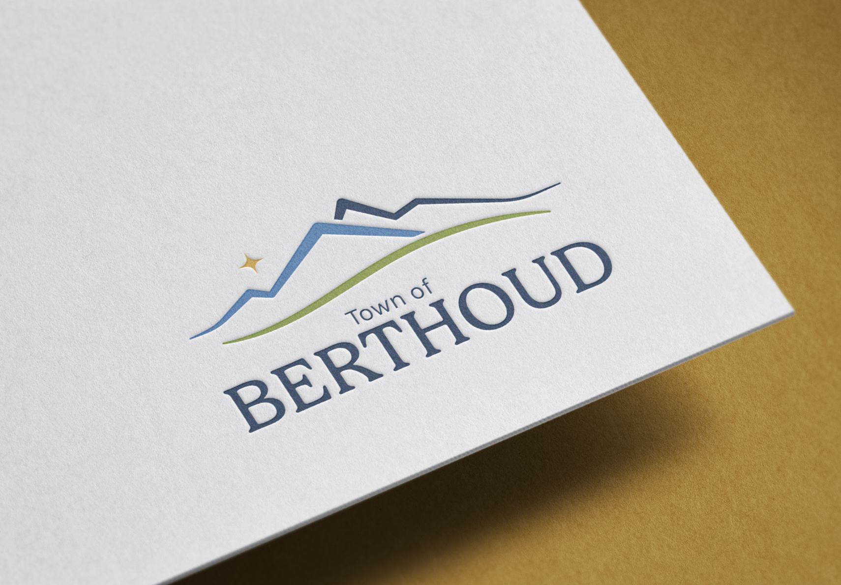
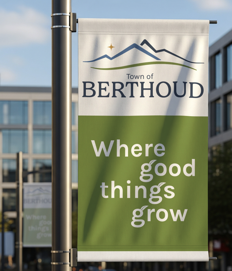
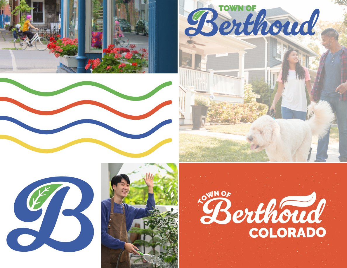
Locality Studio was tasked with creating a new visual identity that would address challenges with the current logo including limitations with flexibility, versatility and accessibility. We presented a strategy to refine, refresh, or reimagine the current logo, with varying levels of changes.
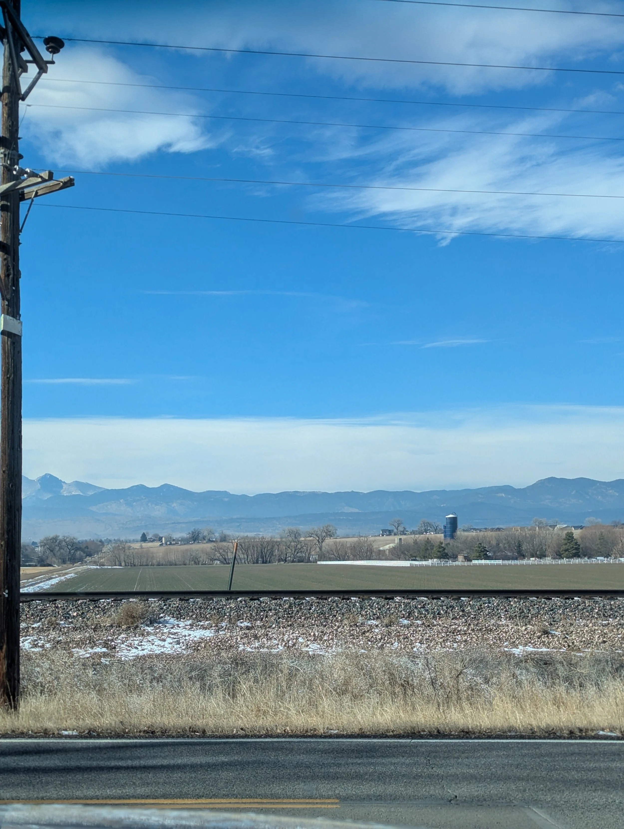
Within each option the goal was to ensure the visuals would reflect this front range community’s scenic beauty and connections to stars (three observatories and upcoming “Dark Skies” designation). As of the end of May 2026, the Working Group unanimously and excitedly selected a final alternative and it was fully approved by the Town’s Board of Trustees.
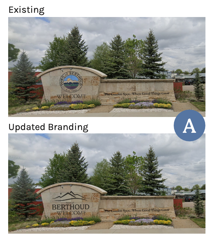
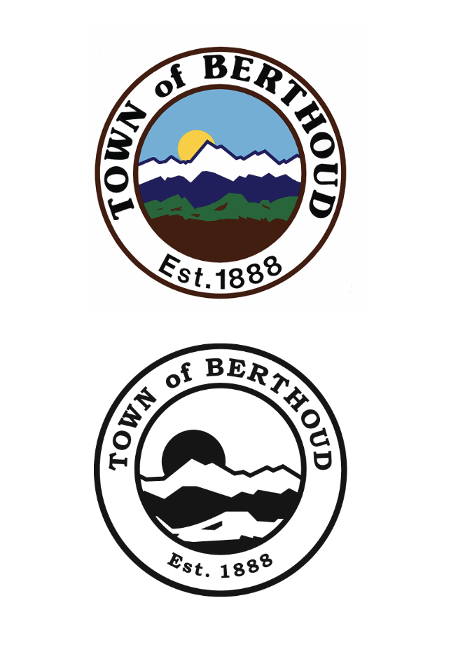
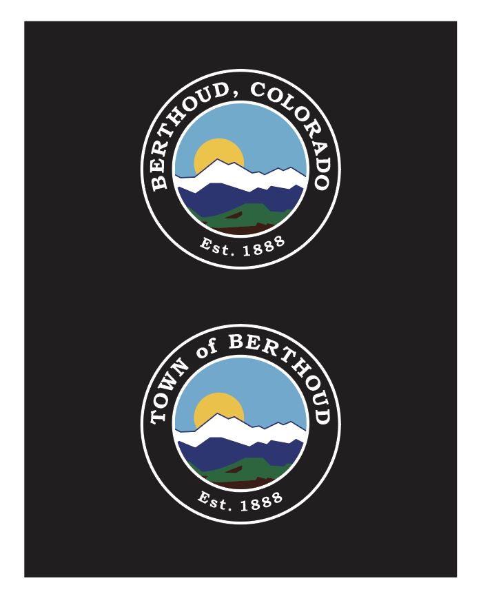
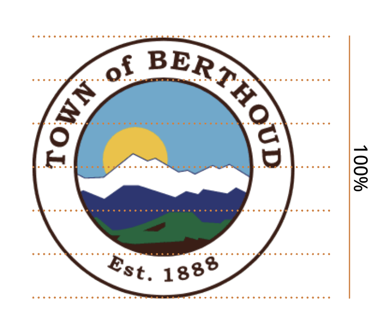
Previous Logo
A variety of logo versions existed throughout Berthoud, from internal files to uses on exterior signage. Locality Studio audited these logo versions, communicating to the public that no only did this array and confusion exist, but the mountain tops were not correct with Berthoud’s view, the sun appears black when using the b/w version, and much of the logo’s real estate is given to the sun and sky rather than the town itself.
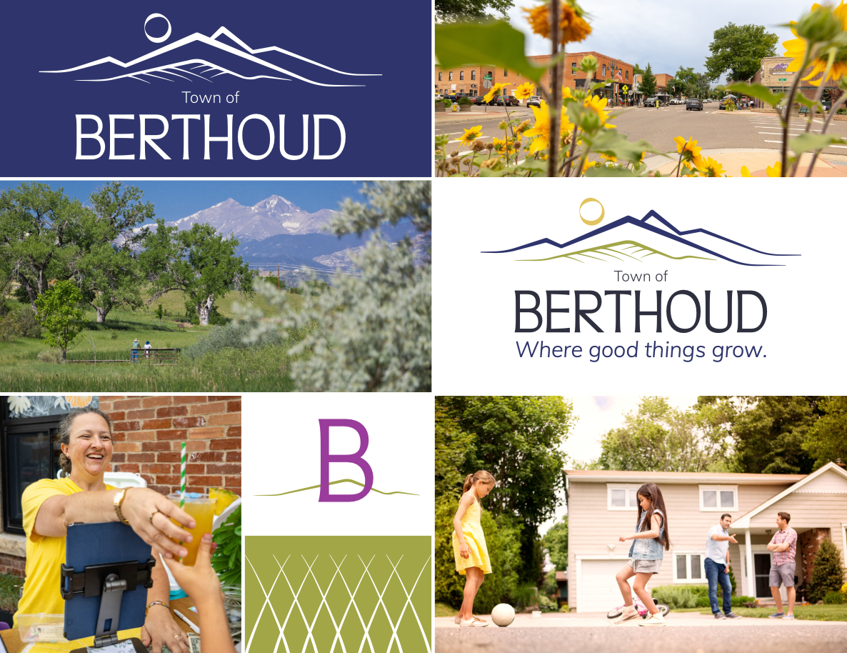
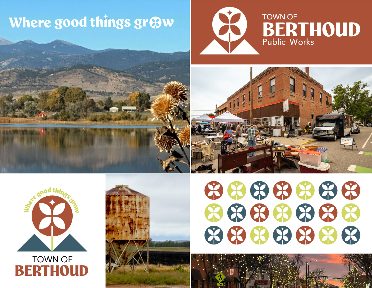
Design Options
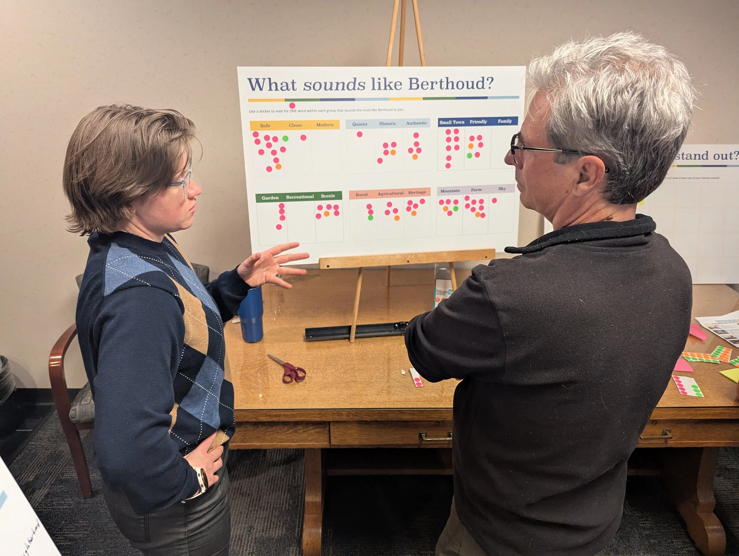
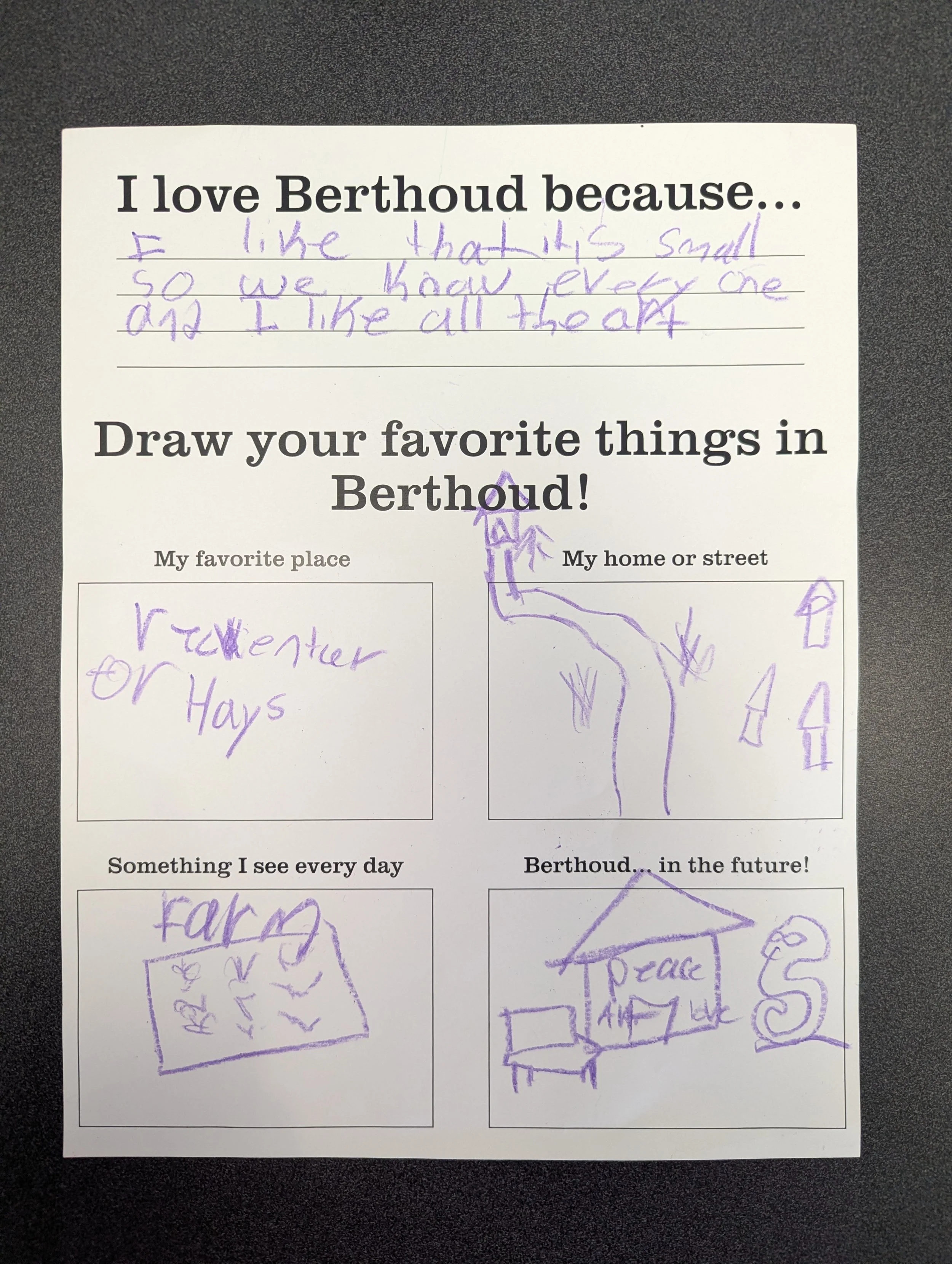
Using research and engagement, three brand designs were created and revised with the Working Group and Town Staff.
Project Highlights
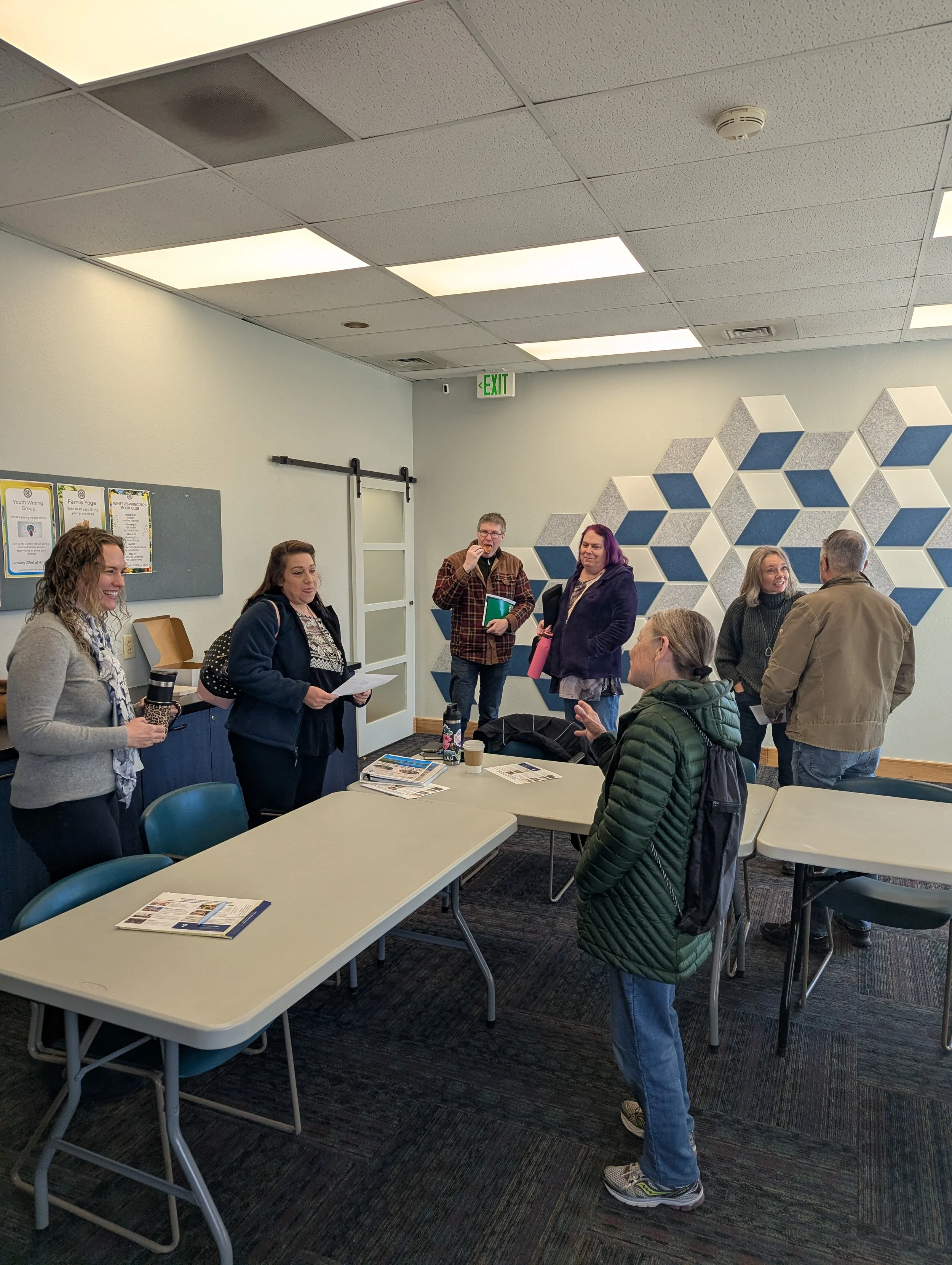
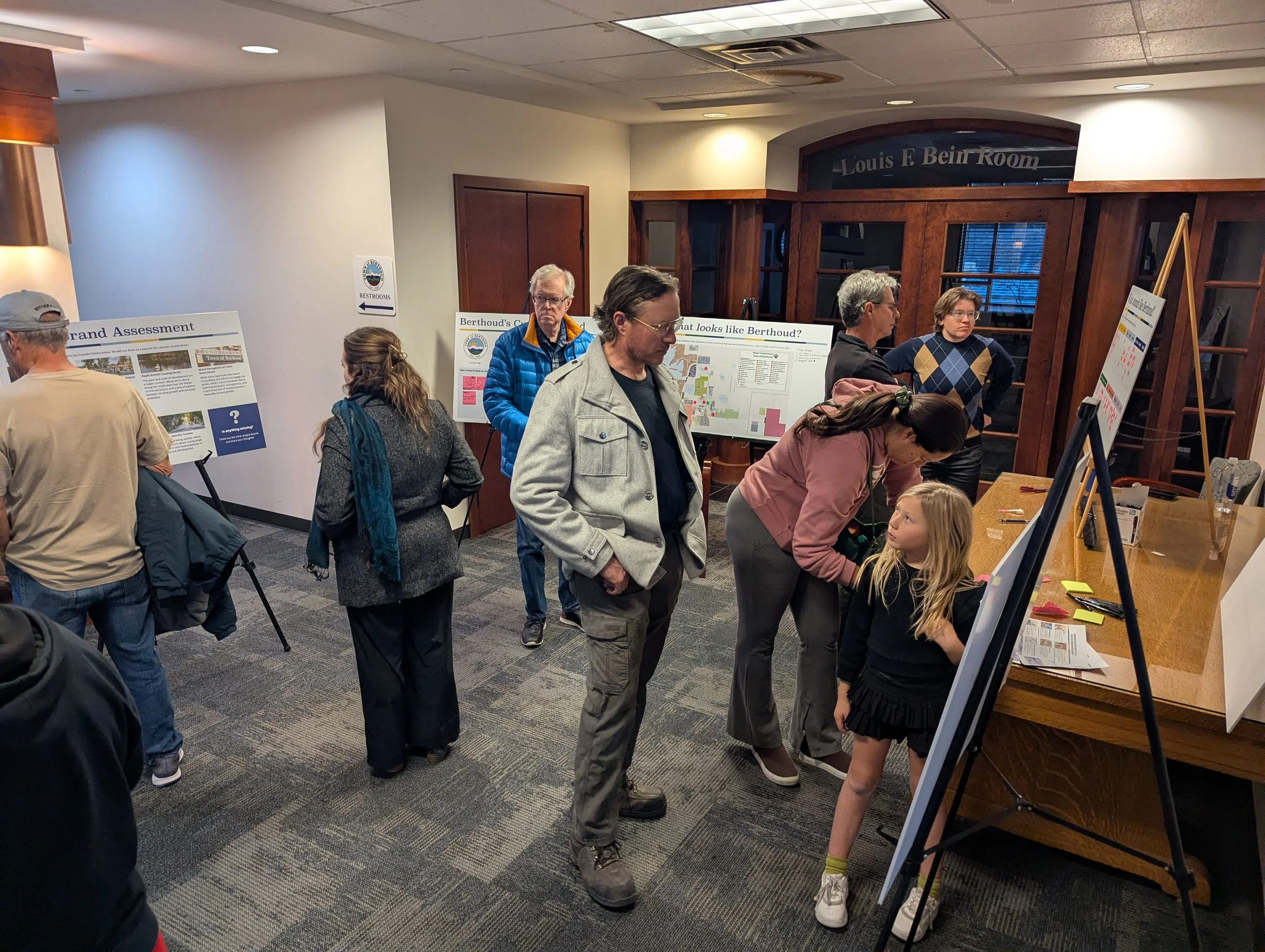
55+ Open House Attendees |
7 Month Timeline |
Full Working Group Consensus |
Full Approval by Board of Trustees |
55+ Open House Attendees | 7 Month Timeline | Full Working Group Consensus | Full Approval by Board of Trustees |
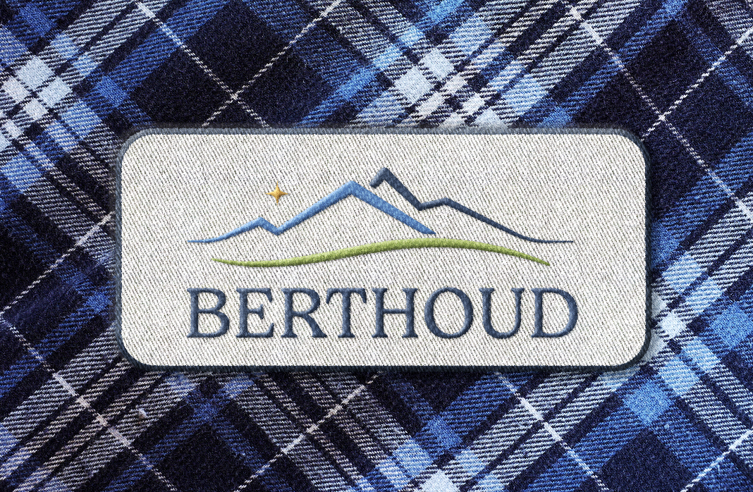
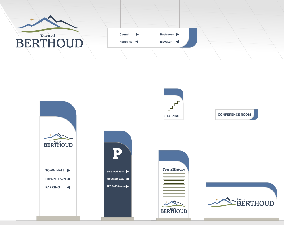
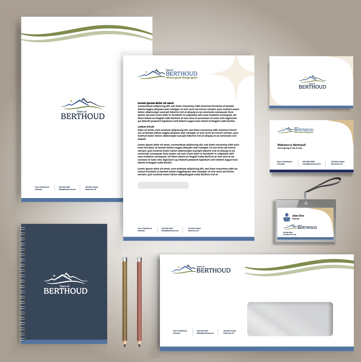
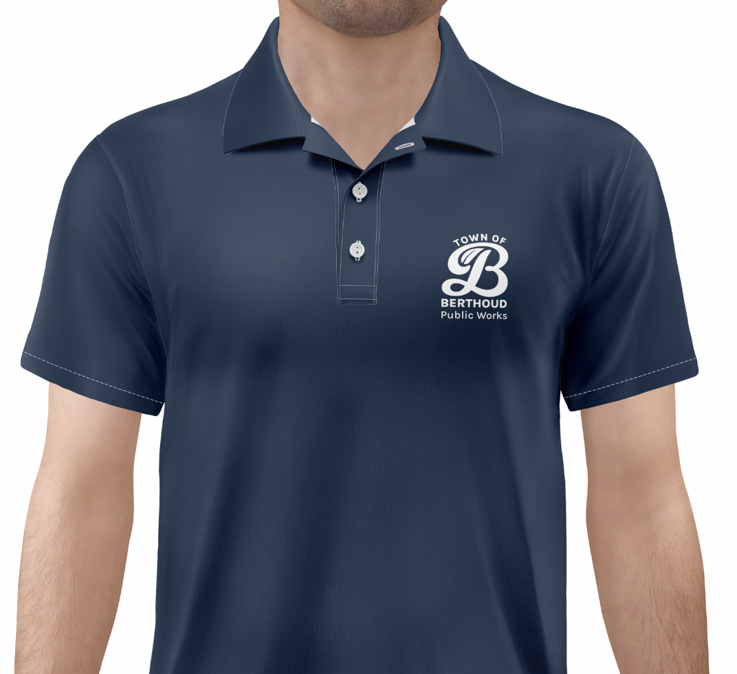
Final Brand