Town of Belchertown, Massachusetts Rebrand
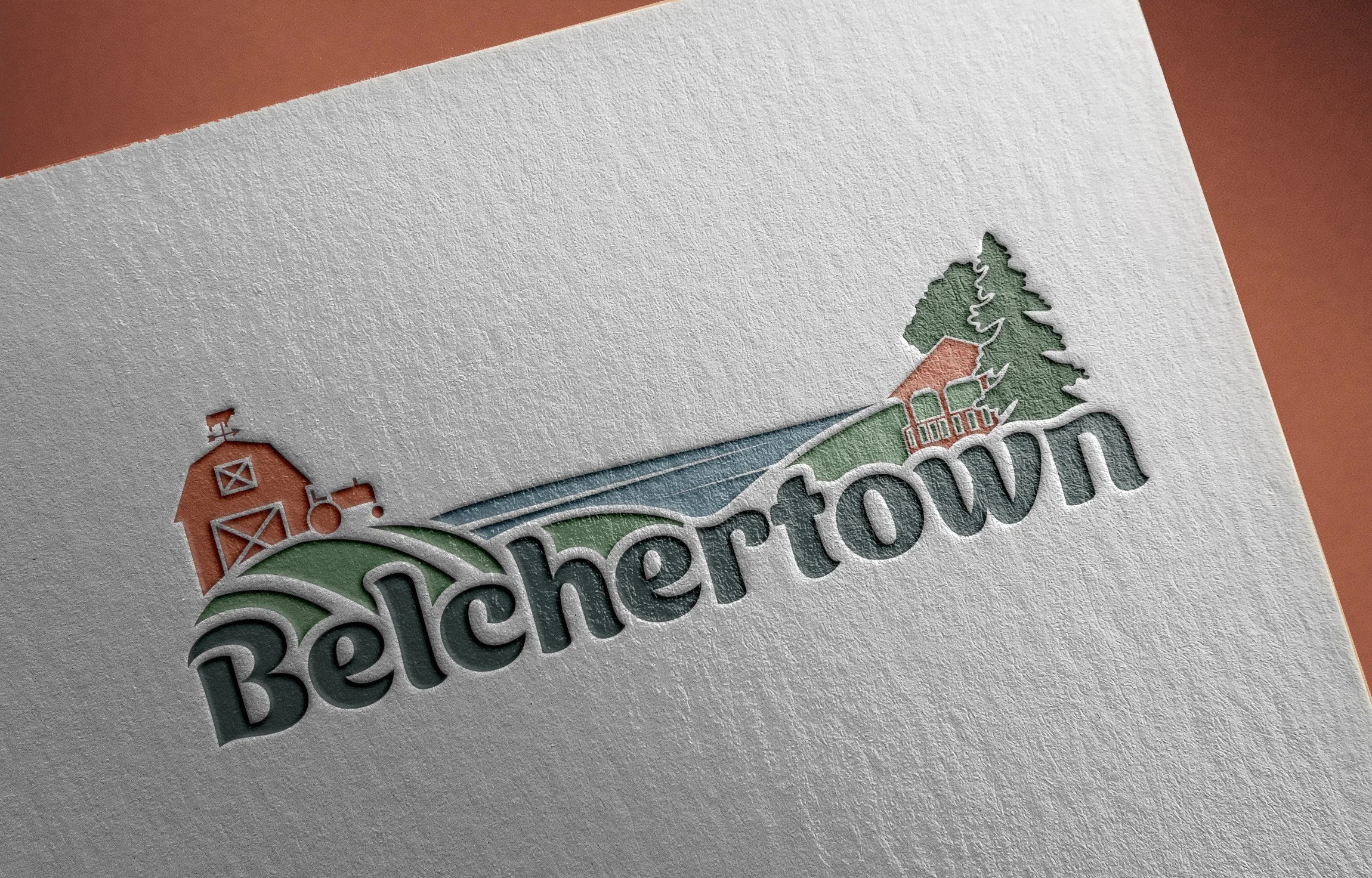

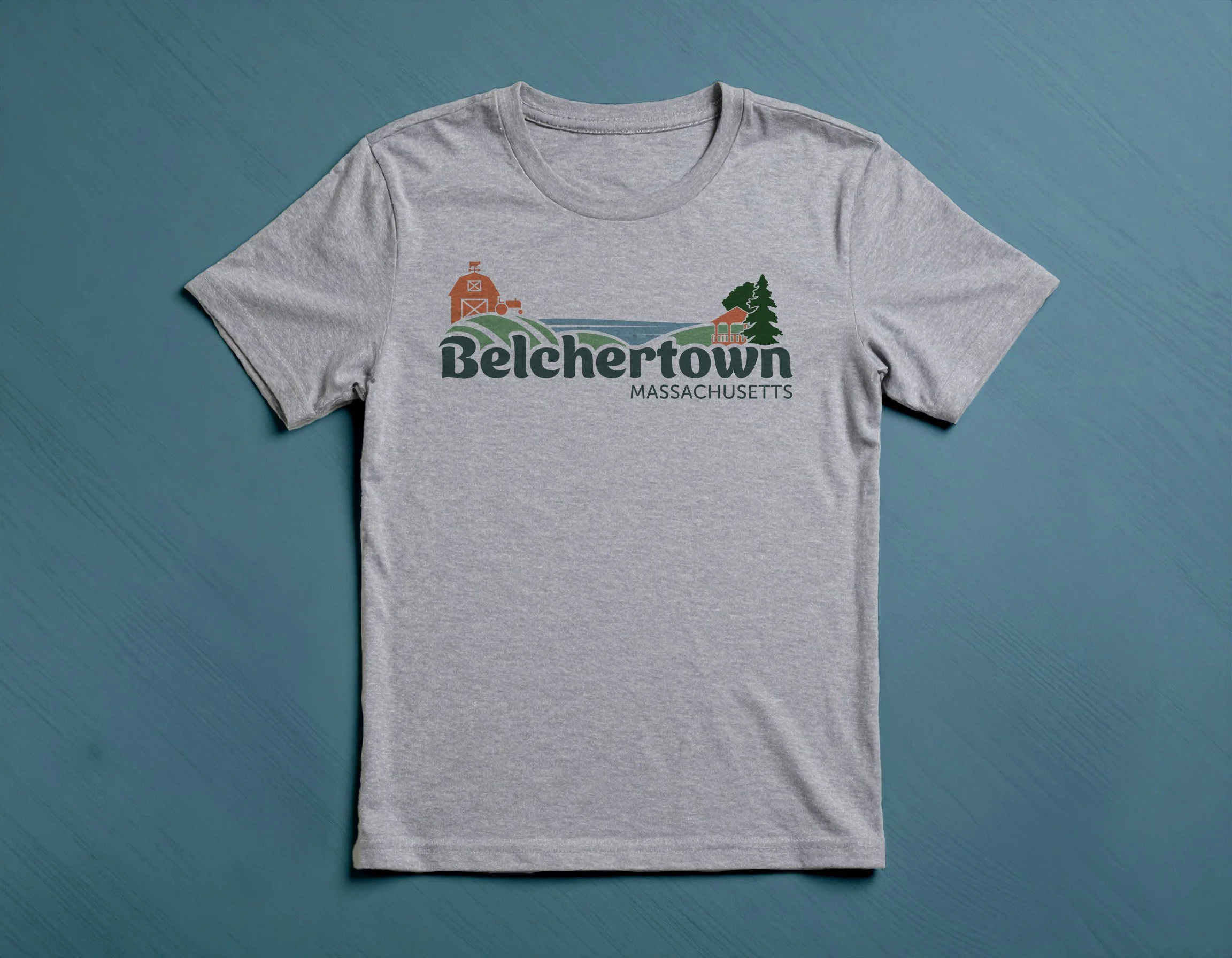
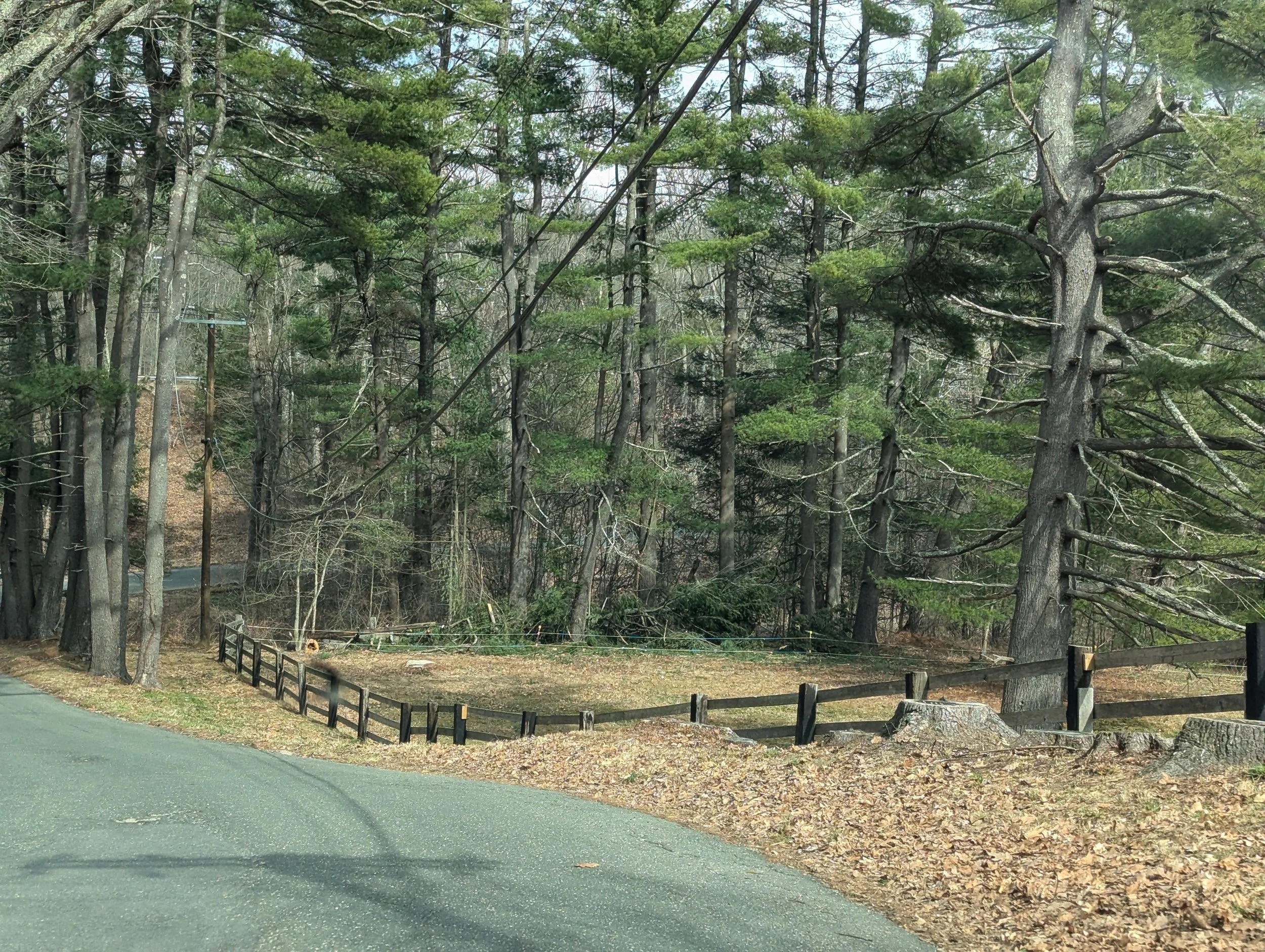
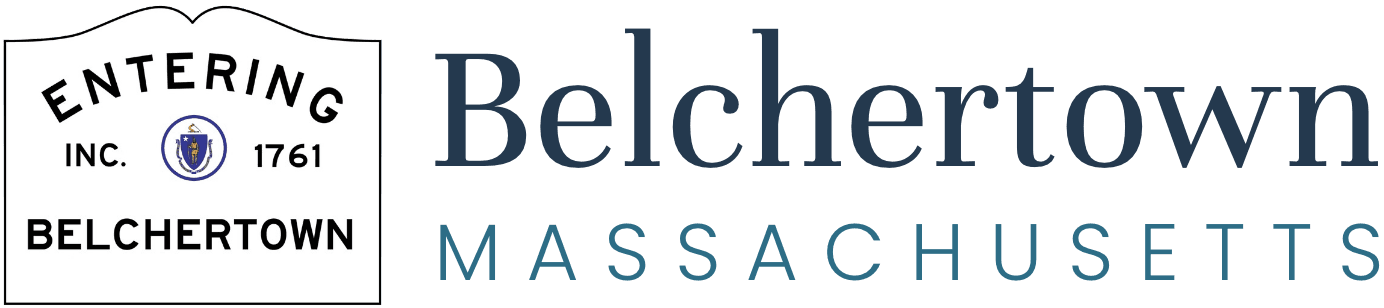
Locality Studio created Belchertown’s new brand from scratch. This quaint small town had been using its entry sign as a stand-in logo (see below) and was ready for something fresh that brought the community together.
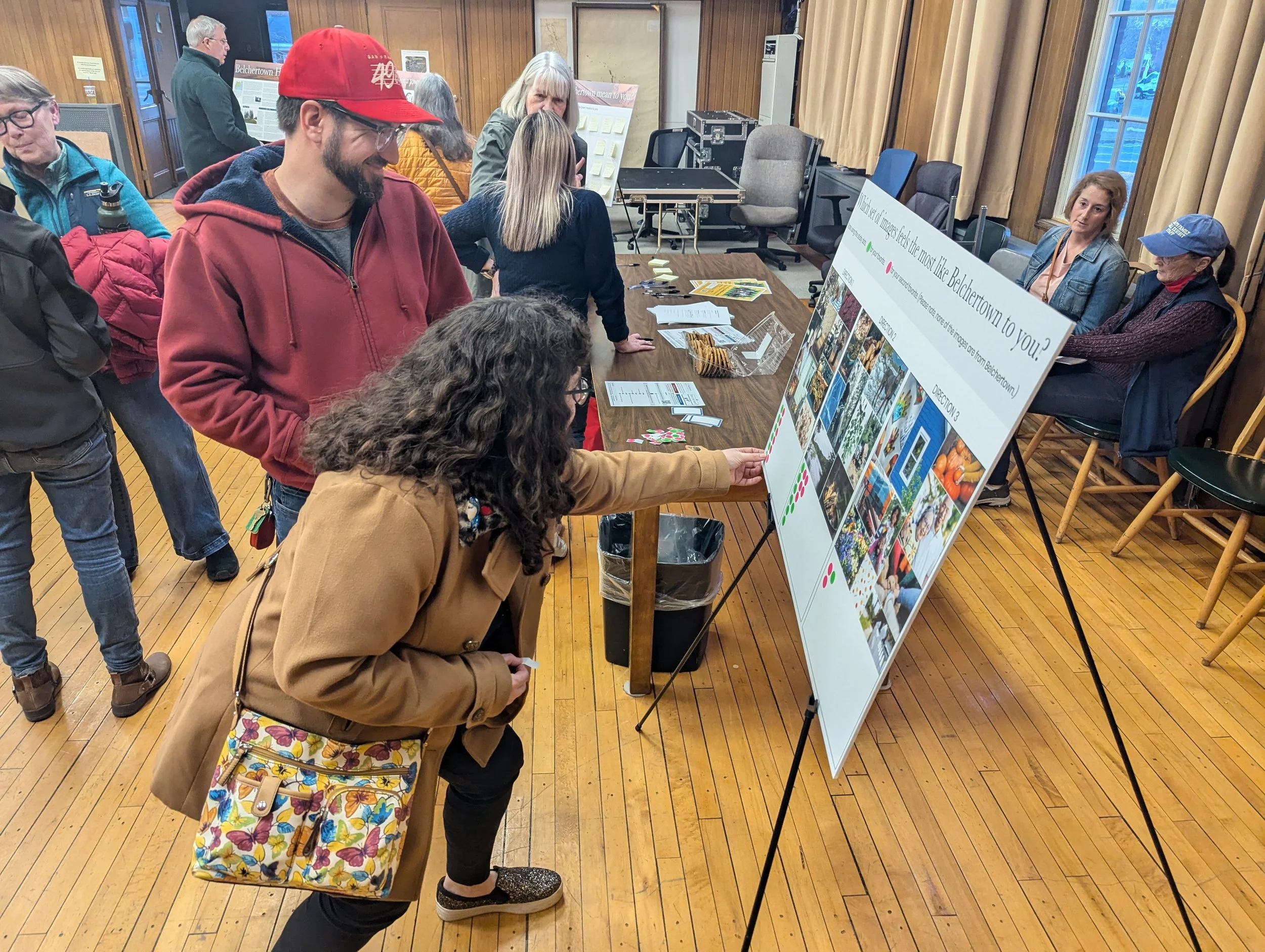
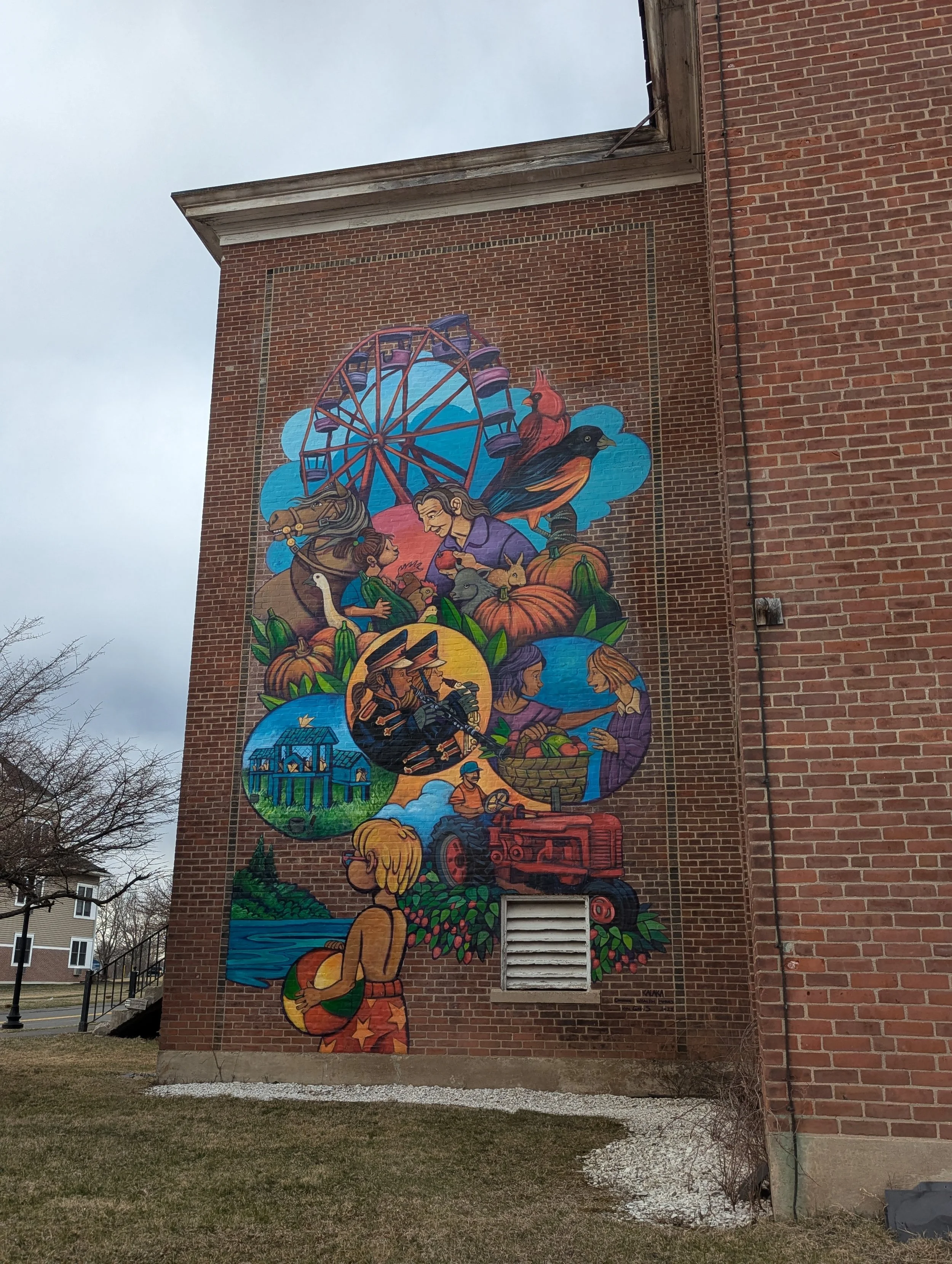
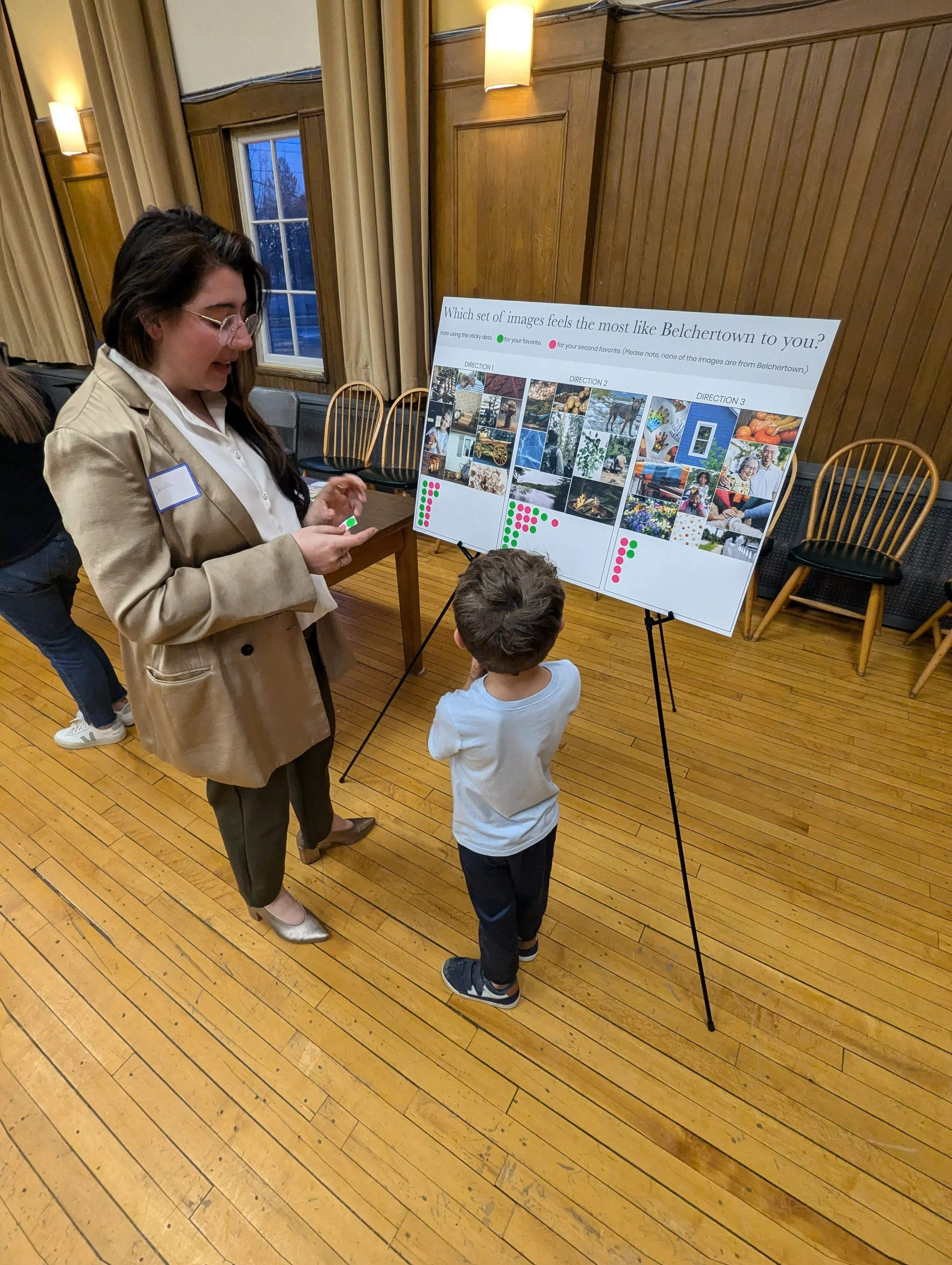
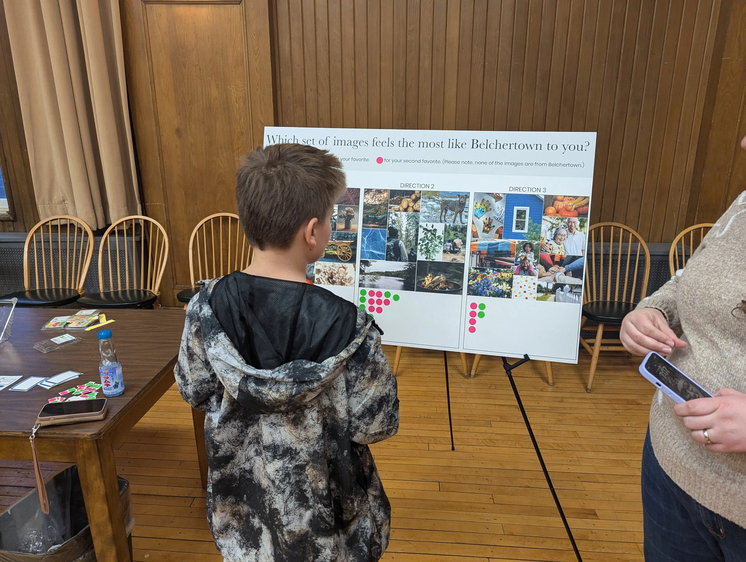
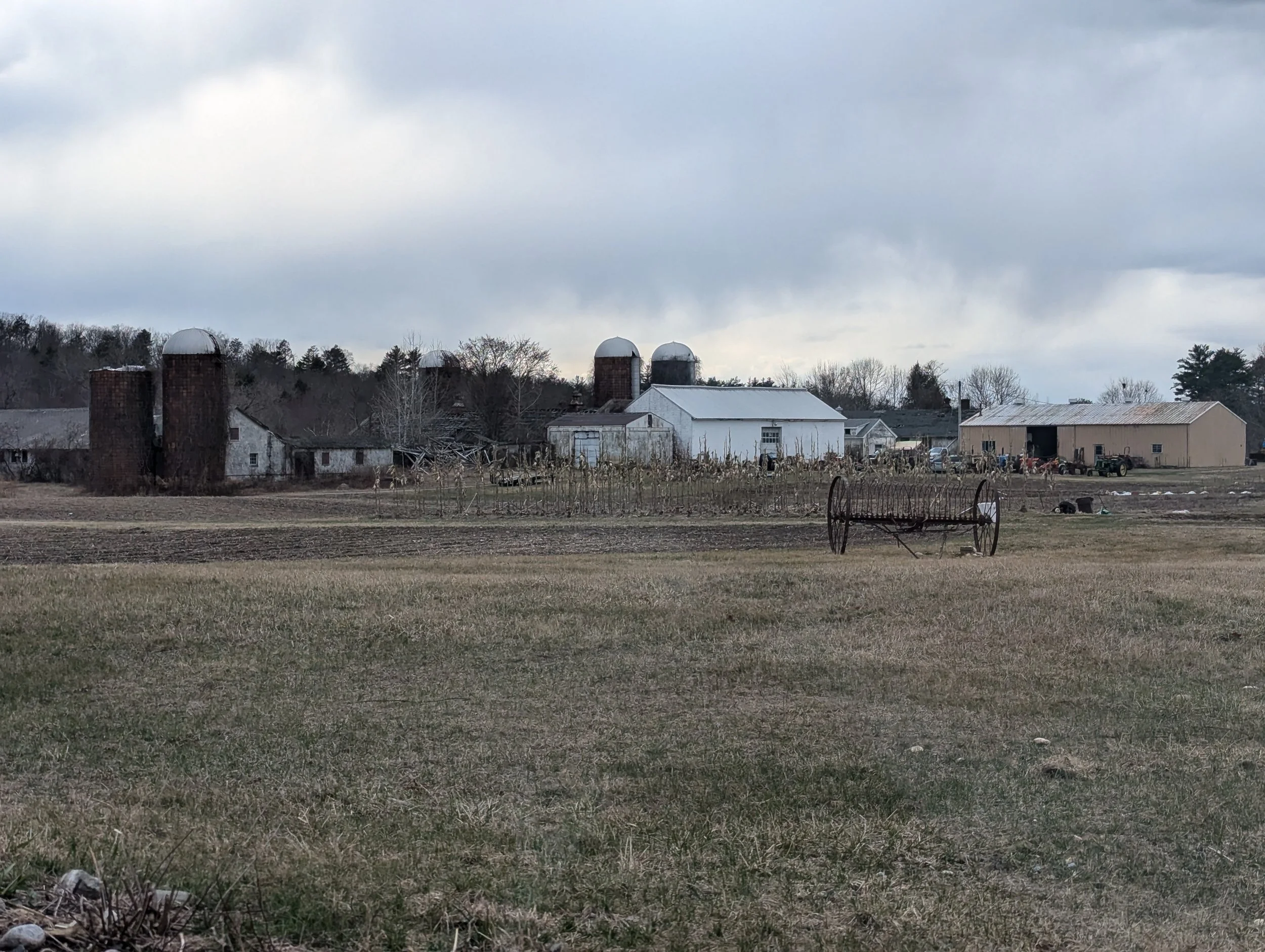
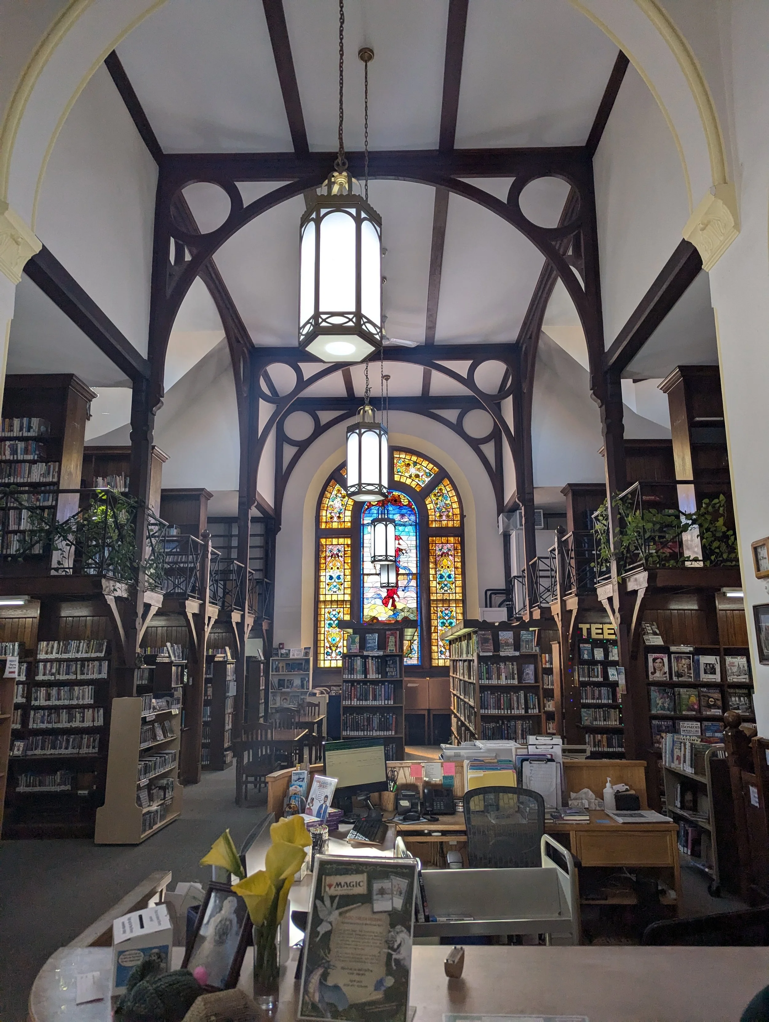
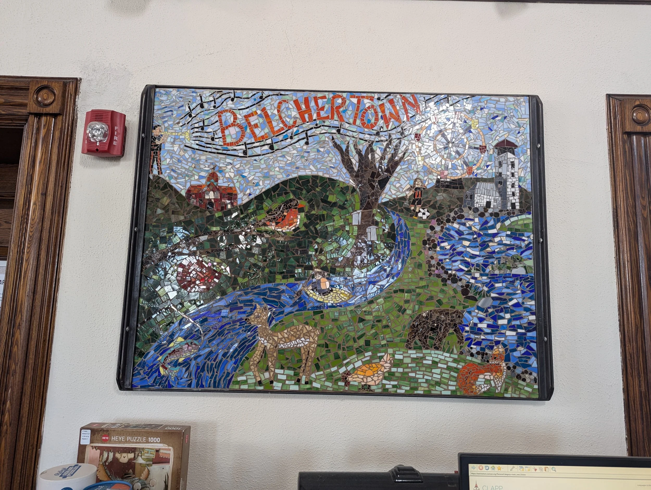
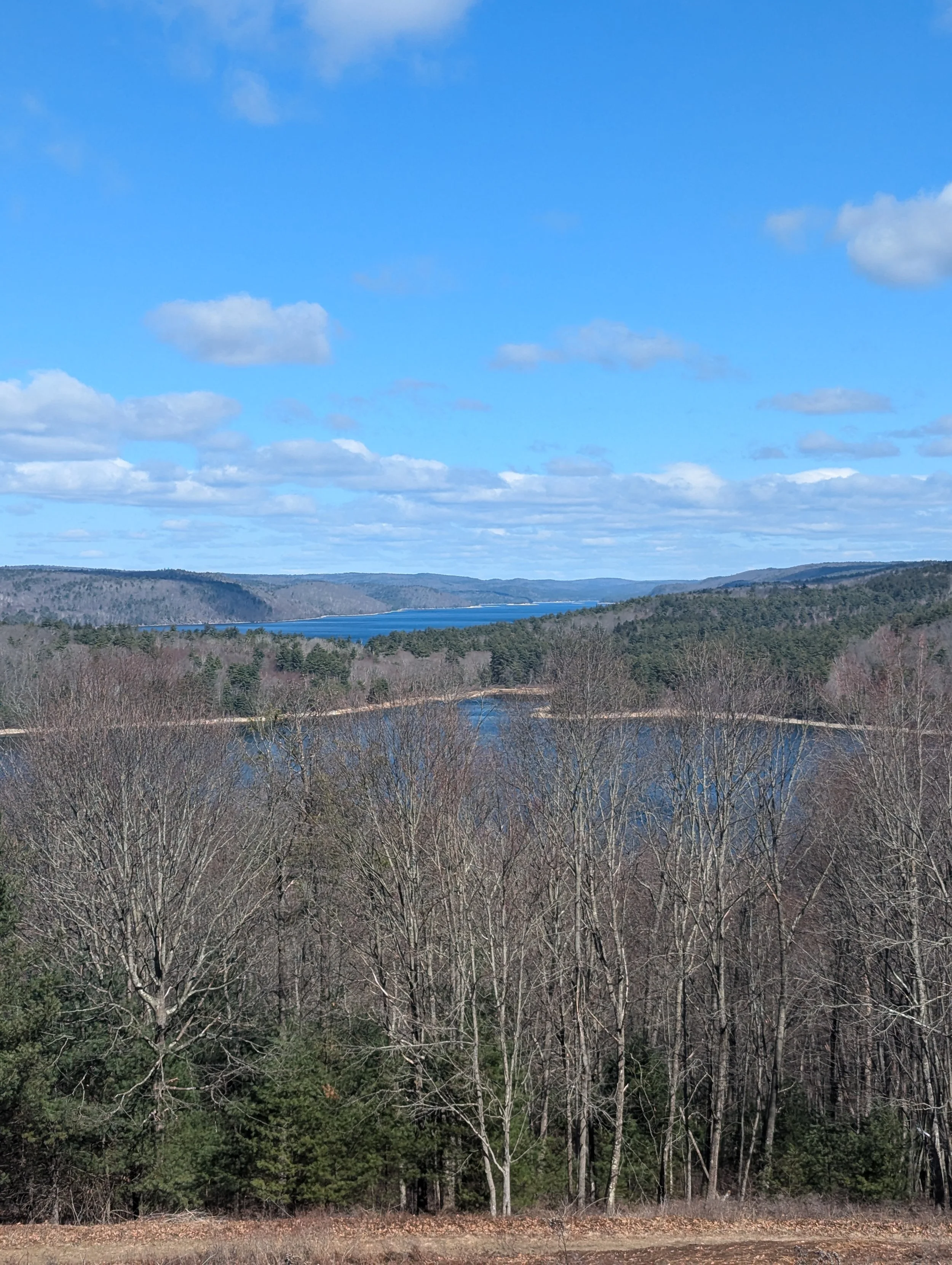
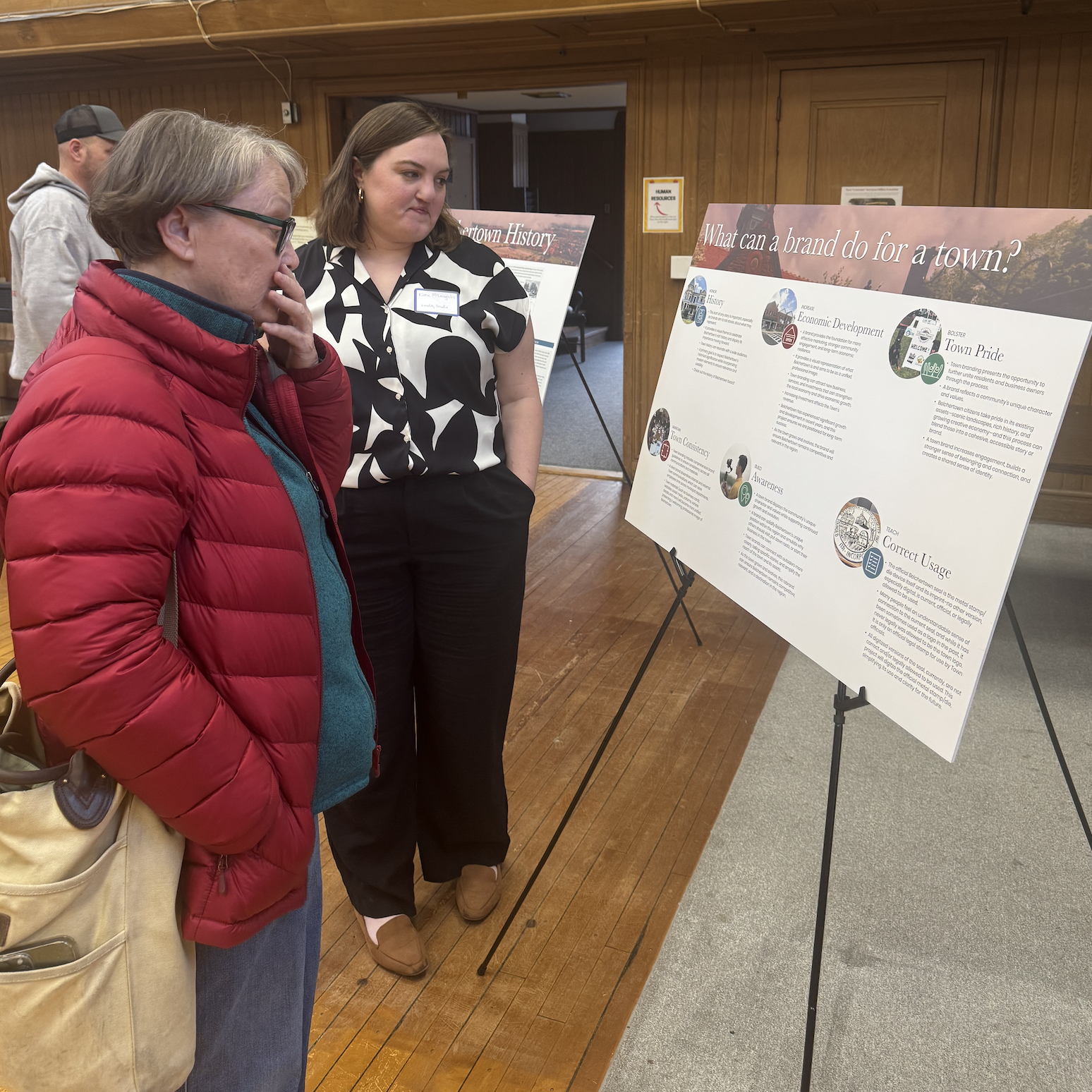
Locality Studio worked with the Branding Belchertown Committee and project partners, incorporating community feedback gathered through meetings, an online survey, and a community open house. The community engagement resulted in the need for a balance of natural/recreational, historic, and rural imagery.
Design Options
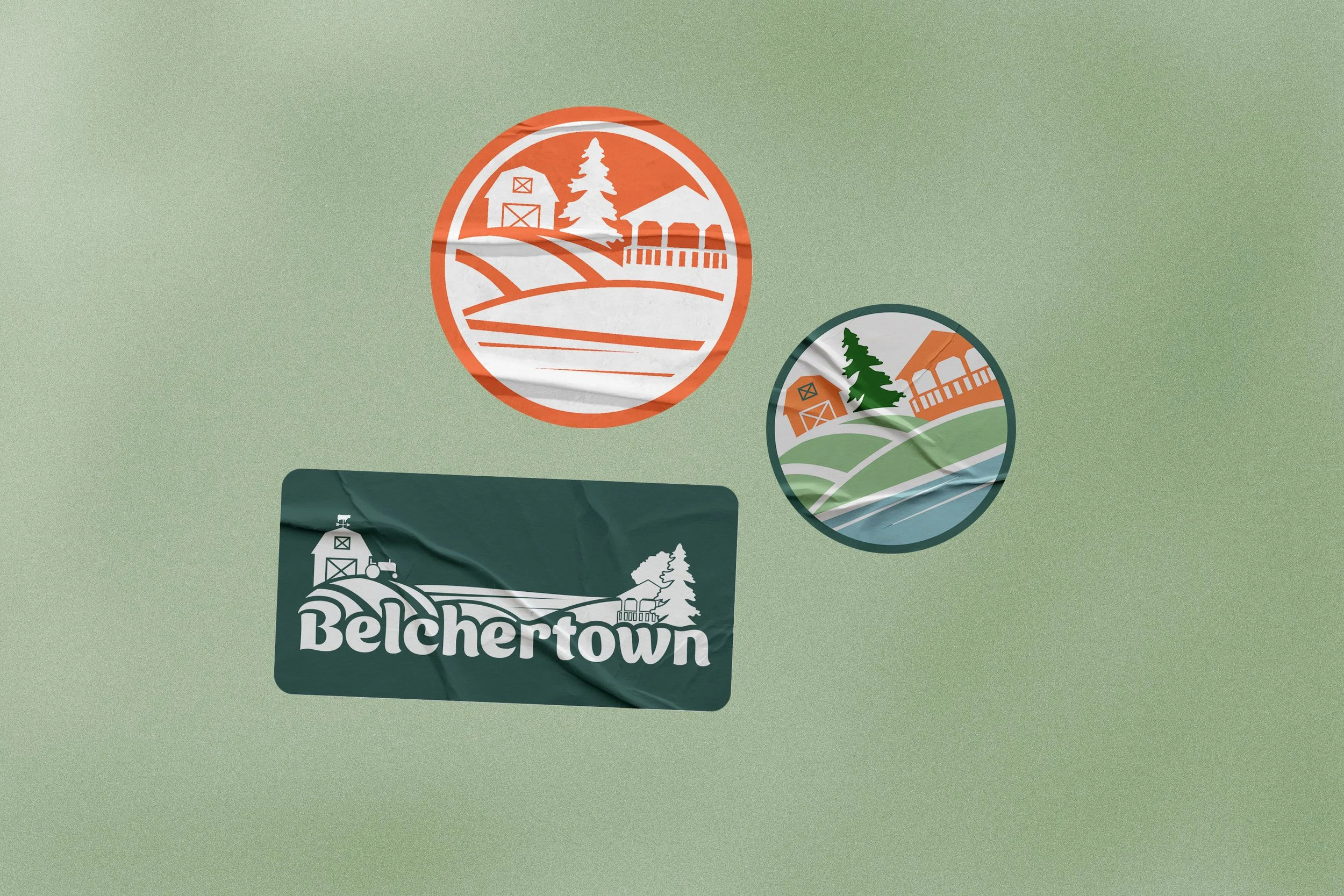
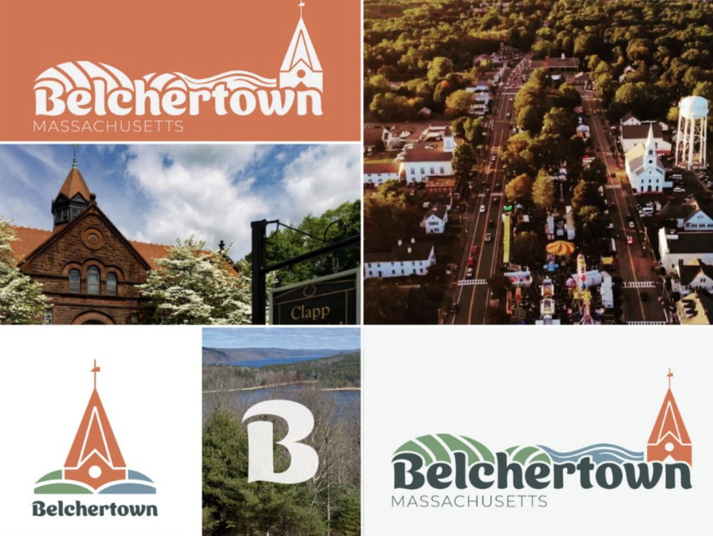
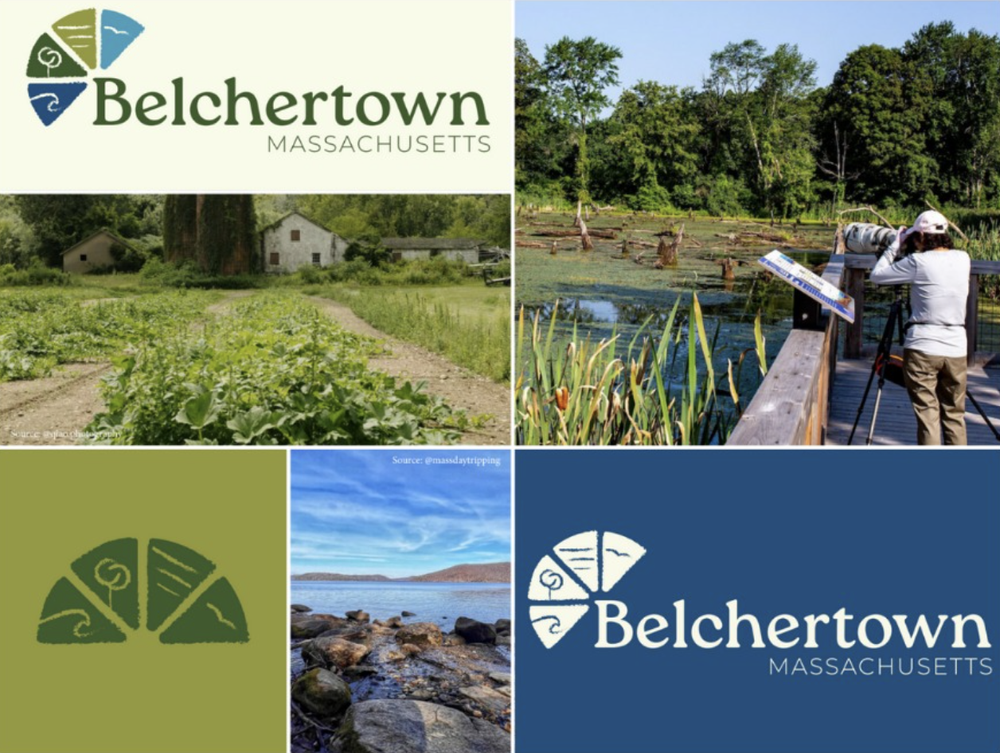
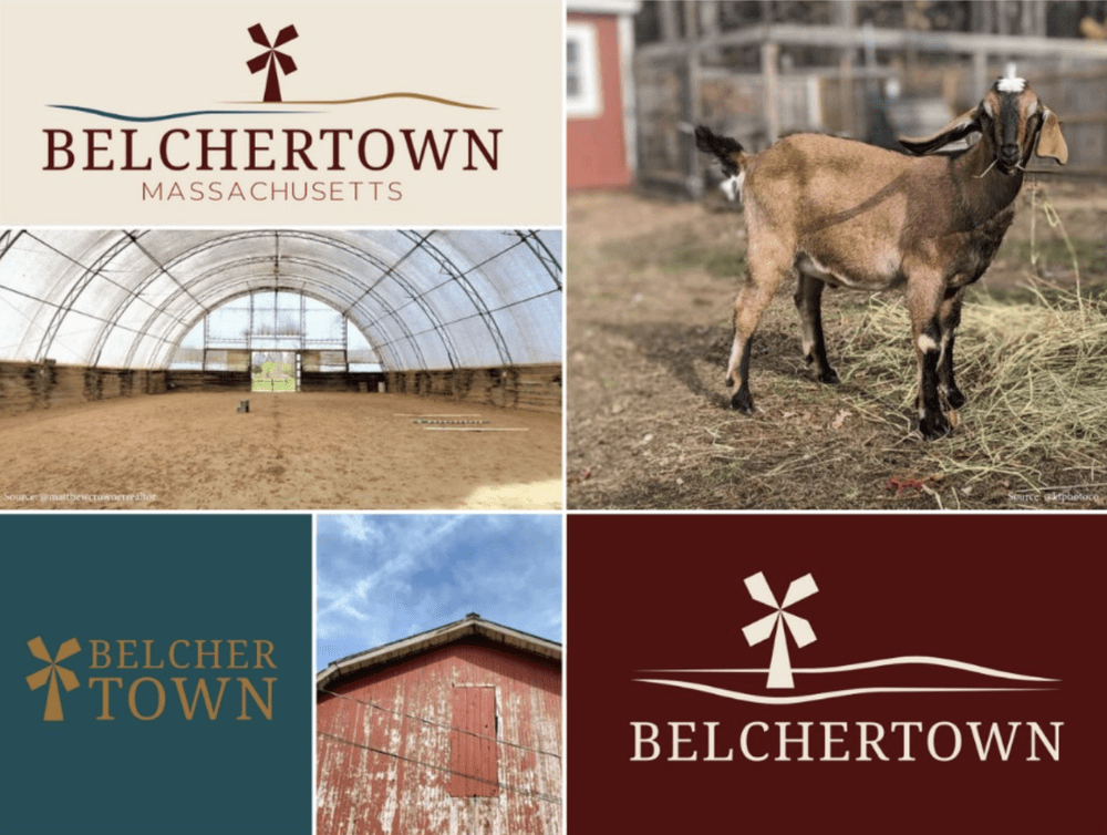
We developed multiple logo concepts and visual directions, helping translate community values and local heritage into a contemporary identity system.
We contributed to the redesign of the town seal and created brand guidelines outlining logo usage, typography, color palette, and overall visual standards to ensure consistency across town communications, signage, and marketing materials.
The three branding choices provided can be seen below:
Project Highlights
120 Survey Responses |
5 Month Timeline |
295 Public Votes on Logo |
120 Survey Responses | 5 Month Timeline | 295 Public Votes on Logo |
Final Brand